
Ask anyone across EAPN’s more than 30 national networks and the answer rarely starts with a logo. It starts with its people, the members who show up to shape shared strategy, the national platforms that carry it into local realities, the people experiencing poverty whose voices are meant to sit at the centre of everything the network does.
“Our visual identity is part of who we are as a network. This new identity reflects our history, our diversity and the values that have guided EAPN for more than 35 years, while giving us a clear and serious way to represent our work today.”
— Carlos Susías, President of EAPN
So, when EAPN set out to design its new visual that process had to be participatory too. Today, the result of that year-long process becomes visible: a new visual identity for EAPN.
A Brand Built the EAPN Way
EAPN’s goal was to create something that represents the values, diversity and the network’s way of working. The creative process was kick-started by a question: how can EAPN’s visual identity feel modern, engaging and distinctive, while reflecting the seriousness of the issues the network works on and the respect the eradication of poverty deserves?
Over the following months, review early logo proposals, react to colour palettes and discuss the meanings and associations behind different proposals. The process brought together perspectives from across EAPN, from national networks to governance bodies.
The feedback shaped the decisions. When it came to the logo, the network swung between a bolder, more dynamic direction and retaining a visible connection to EAPN’s previous brand. In the end, the proposal that stayed closer to the original logo was selected, preserving elements that members felt were important to the network’s identity.
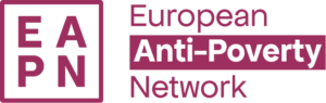
“It does not stray from our old logo, so the transition feels smoother,” one member wrote. “The stability, reliability and sincerity in what we’ve been doing for so long is not dismissed.” Another put it more simply, it still “keeps some references to the original EAPN logo,” enough to “connect people with our visual identity” even as it moves forward.
When it came to a final vote, the decision was almost unanimous, reflecting broad support for the new visual identity. For a project built around finding common ground across a diverse network, that feedback was an important milestone.
What's New
At the centre of the new visual identity is the redesigned logo, which keeps EAPN’s acronym in a clean, modular square grid. A nod to structure and order that reflects the network’s own commitment to organised, impactful change. It is also designed to stay legible across the different spaces where EAPN communicates, from digital platforms and publications to campaigns and events.
The colour palette carries over EAPN’s existing communications colours, with new transitional tones and gradients added. The expanded palette gives EAPN more room to express the diversity of its work while keeping communications recognisably part of the same visual system.
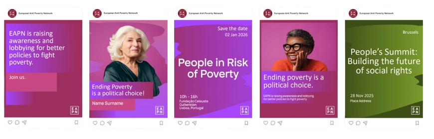
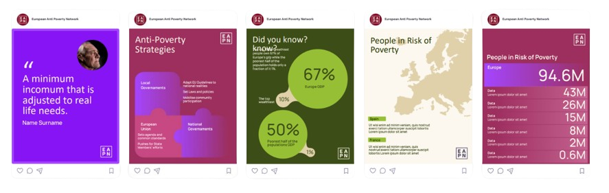
Typography is another key part of the identity. Bold, high-contrast headlines give campaigns and key statements greater presence, with a “punched-out” version for posters and large-format materials. Paired with Manrope for body text, whose wider, more open letterforms make it easier to read across different languages and audiences.
The final layer comes through supporting graphic elements. Squares echo the structure of the logo and provide a consistent way to frame content. While photography and soft, organic brush shapes round out the system, adding warmth and creating a deliberate balance.
Why It Matters
For Susana Anastácio, EAPN Europe’s Senior Communications Officer, the point of the redesign was never simply to give EAPN a new look.
“This wasn’t about giving EAPN a new look for its own sake. EAPN’s work, particularly its work on the participation of people experiencing poverty, is increasingly recognised across Europe. Our visual identity needs to reflect that expertise and the strength of our network.
At the same time, at a moment when hate speech is taking up more and more space, we need a brand that can connect with broader audiences. Poverty may not be an easy or engaging topic, but it affects more people than we often realise. It may be someone close to us who is experiencing poverty, or someone living on the brink of falling into it.
We need a human side to our brand: one that can communicate the seriousness of poverty while also reflecting hope, dignity and the possibility of change.”
What's Next
The launch of the visual identity marks the beginning of a new chapter. Over the coming months, this new visual language will gradually shape how EAPN communicates its campaigns, positions, events and work across Europe.
“This identity gives us a stronger and more consistent way to present who we are and what we stand for across Europe. As our understanding of poverty, and that of the EU institutions, evolves, our communications need to reflect its multidimensional nature and the intersecting inequalities that shape it. We’re very excited to bring it to life across our work, campaigns and communications in the upcoming months.”
— Juliana Wahlgren, Director of EAPN Europe
The first major place where this new visual identity will come together is EAPN Europe’s fully redesigned website, launching at the end of October.
The website will bring the new visual identity into a space designed to make EAPN’s work easier to explore, from our policy positions and campaigns to our resources, stories and members’ activities.
Over the coming weeks, follow EAPN on social media for previews and glimpses as the countdown begins.